
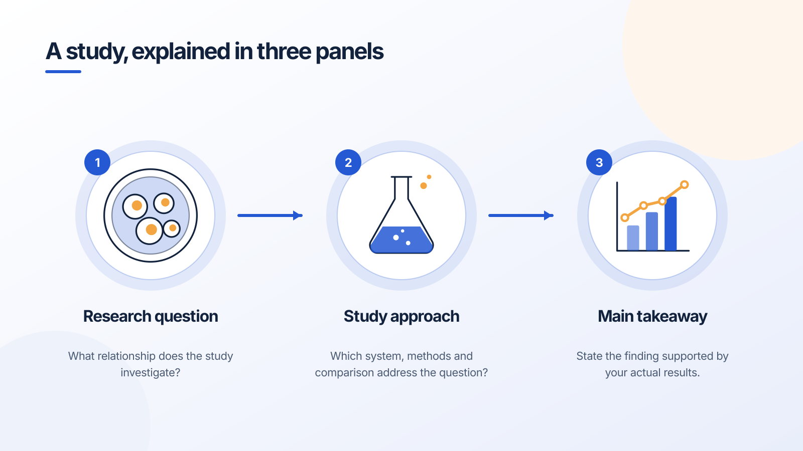
An editable planning template. The text describes what to write; it does not report the findings of a real study.
A graphical abstract is a compact visual summary of a study. It gives the reader a route through the question, the approach and the main finding. It works best when it has one central message and a clear sequence.
Start by writing that message in one sentence. Then identify the minimum context the reader needs to understand it. If you cannot state the takeaway without several qualifications, those qualifications may need to remain visible in the figure.
1. Choose the claim and its boundaries
Write a working sentence with a subject, an observed relationship and the relevant condition. Use the scope supported by the study. A finding in one experimental system should not silently become a claim about every setting.
Next, separate what was measured from what is proposed. A hypothesized mechanism can appear in the same overview as a measured outcome, but its status should be explicit—for example, in a label, line convention or caption.
2. Choose a layout that matches the study
For a general study overview, use question → approach → takeaway. For a methods-focused paper, an experimental workflow may communicate the contribution more clearly. For a mechanism explanation, organize around the relevant components and relationships.
Do not force every project into a left-to-right sequence. A comparison may need two parallel groups; a cycle may need a loop; a mathematical argument may need a construction and the resulting object. The layout should express the relationship.
- Biology example: system and condition → intervention and measurement → supported response.
- Methods example: starting material → processing stages → the usable output.
- Mathematics example: defined object → construction or transformation → the property being illustrated.
3. Remove text that does not help the visual argument
Headings should identify each panel’s job. Labels should name the structures or variables that the reader needs to follow. Move a technical qualification into the caption only if the figure still remains accurate without the reader seeing it immediately.
Avoid shrinking type until everything fits. Instead, remove a secondary branch, combine redundant labels, or split a complex figure into panels. Check the export at its intended size.
A worked example: planning a study overview
Suppose you are explaining a comparison of plant growth under two specified conditions. The first panel identifies the plant system and the comparison. The second shows the documented treatment and measurements. The last summarizes the result you actually observed.
Before results exist, the last panel might instead say “Compare growth measurements.” That is a proposed workflow. Replacing it with a claim such as “Treatment improves growth” would introduce a finding that the planning figure does not establish.
The same distinction applies when using AI. Supply the actual observations and constraints; inspect the output for extra pathways, invented measurements or conclusions you did not provide.
4. Check the destination before finalizing
Use the journal’s current size and format requirements for submission. Check its image-creation rules separately from the artwork’s visual quality and the tool’s usage rights.
Elsevier’s current guidance distinguishes explanatory AI images from graphical abstracts and applies separate restrictions to general-purpose generative image tools. A tool’s download button is not a publication permission.
A prompt to start from
Frequently asked questions
References and further reading
Illustrations are explanatory models. Colors, proportions and selected structures are simplified to support the topic.
Keep exploring
Try it free
Start with a figure. Make it yours.
Open a starter, adapt the labels, and create an illustration for your next lecture or research discussion.
Starter examples are free to open. AI generation and edits use credits.