Underleaf Logo
Underleaf
Blog
Log InTry Free

Learn Figures

Guides

  • How to make a graphical abstract
  • How to create a scientific figure
  • Export scientific figures without losing clarity
  • Add your scientific figure to LaTeX
  • Make diagrams that teach one idea at a time
  • Write a caption that completes the figure

The Figure Maker field guide

How to create a scientific figure

A practical workflow for choosing a figure type, writing a useful prompt, correcting the result and preparing the final image.

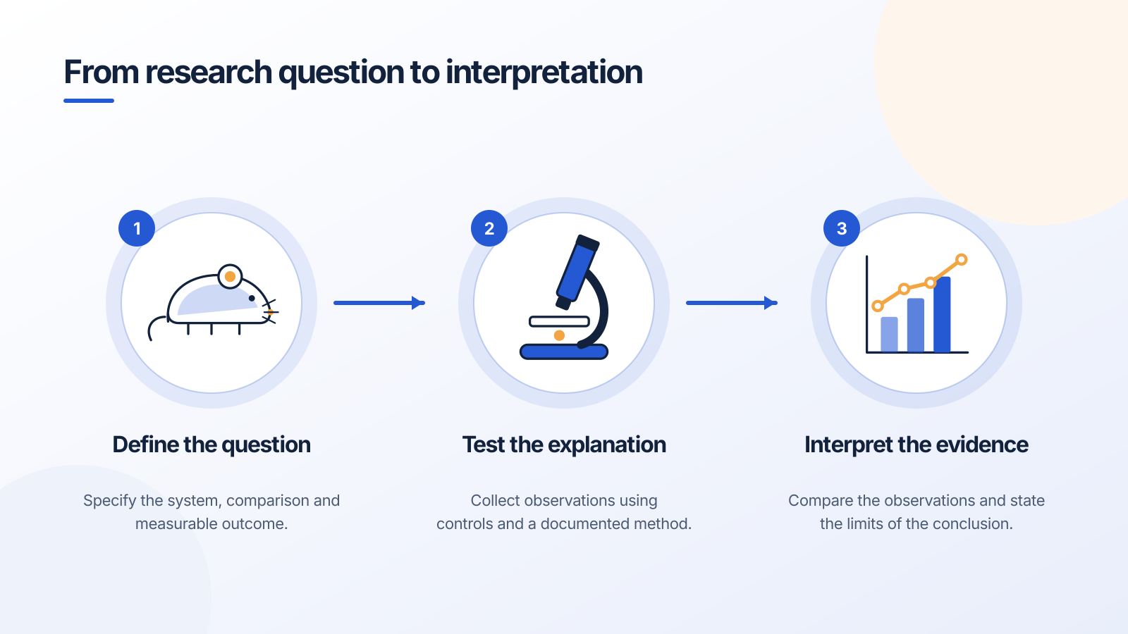
A three-step research workflow from question to method to interpretation
Download PNG

An example planning diagram with editable text and shapes. It describes a workflow rather than reporting an experiment.

Customize this figure

A useful scientific figure answers a question for its reader. It may show where a structure sits, how a process unfolds, what two cases share, or how a measured quantity changes. Decide which of those jobs matters before choosing the drawing tool.

Illustrations, schematics and data plots require different kinds of control. A beautiful image can still be the wrong figure if the explanation depends on exact coordinates, a measured scale or a reproducible calculation.

Choose the figure type before the tool

Use an illustration for recognizable structures and a conceptual overview. Use a schematic when the relationships, stages or arrows carry the meaning. Use a plot when the figure should be derived from data.

For mathematical diagrams, determine whether the image is an intuition-building sketch or part of an exact construction. If lengths, angles or intersections carry the argument, preserve a source representation you can inspect and regenerate.

Write a brief with the information that matters

Name the subject, the audience and the relationship being explained. List the necessary labels. State any invariants: a component that must remain, an arrow whose direction matters, or a distinction between proposed and observed relationships.

For an edit, keep the request narrow. “Increase the nucleus label size and move it away from the leader line” is easier to verify than “make it better.” A useful prompt also says which parts should stay unchanged.

  • Subject: what should be visible?
  • Meaning: which relationship should the reader understand?
  • Audience: how much terminology can they already interpret?
  • Constraints: which labels, positions or distinctions must be preserved?

Inspect the first result in two passes

First check the science. Verify structures, labels, orientation, arrow direction and any units or symbols. Then check communication: reading order, unnecessary detail, text size and the point of emphasis.

Separate these passes so a polished layout does not distract you from a factual error. An internal model check can help identify issues, but the final explanation remains your responsibility.

Create purposeful versions

A lecture overview and a paper draft may use the same base illustration with different label density. Keep a useful version before requesting a substantial change, and compare the outputs against the original brief.

Create variants because the audience or purpose changes. A lighter label set for a classroom slide is a useful variation. A different color scheme with no communication benefit may be unnecessary work.

Export, place and inspect again

Download the figure in a format suited to its destination. Put it into the actual slide or document and inspect it at the size the reader will see. A label that looks large on a full-screen canvas may be tiny inside a two-column paper.

Add a caption that identifies the system and explains relevant symbols or simplifications. Keep your editable source so later corrections do not require recreating the entire figure.

A prompt to start from

Create an experimental workflow with three stages: define the research question, collect observations with appropriate controls, and interpret the evidence. Keep each stage in a separate panel with short editable labels and clear left-to-right arrows. Do not add results or numerical data.
Use this prompt

Frequently asked questions

References and further reading

Illustrations are explanatory models. Colors, proportions and selected structures are simplified to support the topic.

Keep exploring

Try it free

Start with a figure. Make it yours.

Open a starter, adapt the labels, and create an illustration for your next lecture or research discussion.

Starter examples are free to open. AI generation and edits use credits.

A three-step research workflow from question to method to interpretation

On this page

For lectures, research discussions and your next scientific explanation.

Explore Figure Maker

The Figure Maker field guide

How to create a scientific figure

A practical workflow for choosing a figure type, writing a useful prompt, correcting the result and preparing the final image.

A three-step research workflow from question to method to interpretation
Download PNG

An example planning diagram with editable text and shapes. It describes a workflow rather than reporting an experiment.

A useful scientific figure answers a question for its reader. It may show where a structure sits, how a process unfolds, what two cases share, or how a measured quantity changes. Decide which of those jobs matters before choosing the drawing tool.

Illustrations, schematics and data plots require different kinds of control. A beautiful image can still be the wrong figure if the explanation depends on exact coordinates, a measured scale or a reproducible calculation.

Choose the figure type before the tool

Use an illustration for recognizable structures and a conceptual overview. Use a schematic when the relationships, stages or arrows carry the meaning. Use a plot when the figure should be derived from data.

For mathematical diagrams, determine whether the image is an intuition-building sketch or part of an exact construction. If lengths, angles or intersections carry the argument, preserve a source representation you can inspect and regenerate.

Write a brief with the information that matters

Name the subject, the audience and the relationship being explained. List the necessary labels. State any invariants: a component that must remain, an arrow whose direction matters, or a distinction between proposed and observed relationships.

For an edit, keep the request narrow. “Increase the nucleus label size and move it away from the leader line” is easier to verify than “make it better.” A useful prompt also says which parts should stay unchanged.

  • Subject: what should be visible?
  • Meaning: which relationship should the reader understand?
  • Audience: how much terminology can they already interpret?
  • Constraints: which labels, positions or distinctions must be preserved?

Inspect the first result in two passes

First check the science. Verify structures, labels, orientation, arrow direction and any units or symbols. Then check communication: reading order, unnecessary detail, text size and the point of emphasis.

Separate these passes so a polished layout does not distract you from a factual error. An internal model check can help identify issues, but the final explanation remains your responsibility.

Create purposeful versions

A lecture overview and a paper draft may use the same base illustration with different label density. Keep a useful version before requesting a substantial change, and compare the outputs against the original brief.

Create variants because the audience or purpose changes. A lighter label set for a classroom slide is a useful variation. A different color scheme with no communication benefit may be unnecessary work.

Export, place and inspect again

Download the figure in a format suited to its destination. Put it into the actual slide or document and inspect it at the size the reader will see. A label that looks large on a full-screen canvas may be tiny inside a two-column paper.

Add a caption that identifies the system and explains relevant symbols or simplifications. Keep your editable source so later corrections do not require recreating the entire figure.

A prompt to start from

Create an experimental workflow with three stages: define the research question, collect observations with appropriate controls, and interpret the evidence. Keep each stage in a separate panel with short editable labels and clear left-to-right arrows. Do not add results or numerical data.
Use this prompt

Frequently asked questions

References and further reading

Illustrations are explanatory models. Colors, proportions and selected structures are simplified to support the topic.

Keep exploring

Try it free

Start with a figure. Make it yours.

Open a starter, adapt the labels, and create an illustration for your next lecture or research discussion.

Starter examples are free to open. AI generation and edits use credits.

A three-step research workflow from question to method to interpretation
Underleaf Logo
Underleaf

Practical tools for academic writing, document conversion, and research workflows.

Go to appContact us

Company

PricingBlogTutorialsConference TemplatesConference Deadlines

Free Tools

Image to LaTeXExcel to LaTeXArXiv to LaTeXTikZ GeneratorLaTeX Table GeneratorCitation GeneratorThesis GeneratorChrome ExtensionAll Tools

Ask AI about Underleaf

Ask ChatGPTAsk ClaudeAsk Perplexity

© 2026 Underleaf. All rights reserved.